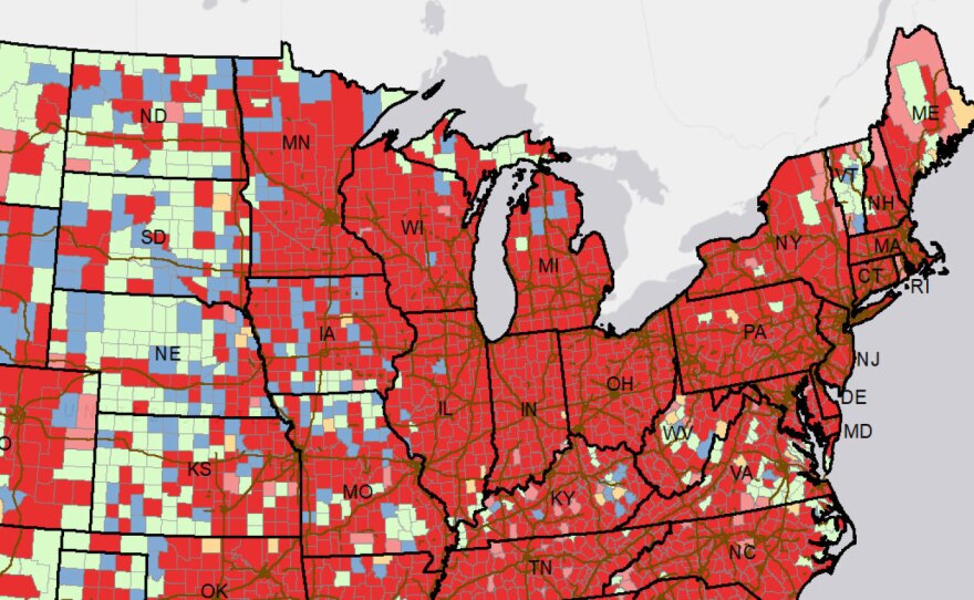
The Trump administration on Friday made public a trove of federal data on the pandemic that reveals a country awash in red alerts.
The data contain a wealth of previously undisclosed information, including counties the federal government considers "hotspots," forecasts for whether virus cases are likely to increase at a local level, and information on cases, deaths and tests by metro area.
"This will give the American people the same community level information that is available to federal personnel," wrote federal officials who are responsible for the release of the data and who belong to an interagency group working for the White House Coronavirus Task Force.
In a statement posted on the website healthdata.gov, they promised daily updates. "We hope the publication of this data will help Americans make personal choices to slow the spread."
The newly disclosed data reveal that nearly 900 out of 938 metropolitan areas and more than 2,000 out of 3,270 counties qualify as "sustained hotspots," meaning they have "potentially higher risk for experiencing healthcare resource limitations." It also showed that more than a dozen metro areas and nearly 50 counties saw a 500% or greater increase in deaths from the previous week.
Some of the information is similar to metrics the task force previously sent to governors in weekly reports. The documents, which the White House never made public, are now only available if states request them. The Center for Public Integrity has been collecting and publishing them.
The data release comes nearly 11 months after the first confirmed coronavirus case in the United States. More than 300,000 Americans have died of COVID-19, with fatalities now topping 3,000 per day.
"This data release is monumental. ... We have to celebrate this moment," says Ryan Panchadsaram, who co-founded covidexitstrategy.org and advocates for more pandemic data to be made public. But he adds, "For this to be released so late — it really is a shame."
The dataset contains some information not previously available on any state or federal dashboard: For example, the Kansas City metro area, which crosses state lines, saw a 14% decrease in new cases in recent weeks but a 22% increase in deaths. It also has information on college students, poverty levels, test turnaround times and much more — allowing researchers and the public to do deep-dive analyses to understand better where to focus public health efforts.
"What's special about this is that it's a national, consistent view," Panchadsaram says. "It's still not too late to get good information out to the places that still don't believe that this virus should be taken seriously."
The new data release does not contain the task force's policy recommendations for governors and health leaders, as the governors' reports did. Those reports, using increasingly plaintive language, in recent weeks urged states to adopt stricter measures to contain the coronavirus, including curbing or banning indoor dining.
The new data also show that as of Friday, every state but Hawaii remains in what the task force has called the "red zone" for new cases, with more than 100 new cases per 100,000 residents in the previous week.
And every state but Hawaii is now in the task force's "red zone" for new deaths, with more than two per 100,000 residents in the previous week — a change from the Dec. 13 governor's report, which had Washington in the yellow zone.
The data show how seriously the pandemic is affecting each state and local area, Panchadsaram says, and the upshot "is that it's all really bad."
The new data also include information on U.S. territories, which the previous reports to governors did not have.
NPR's Pien Huang contributed to this report.
Copyright 2020 The Center for Public Integrity. To see more, visit The Center for Public Integrity.


