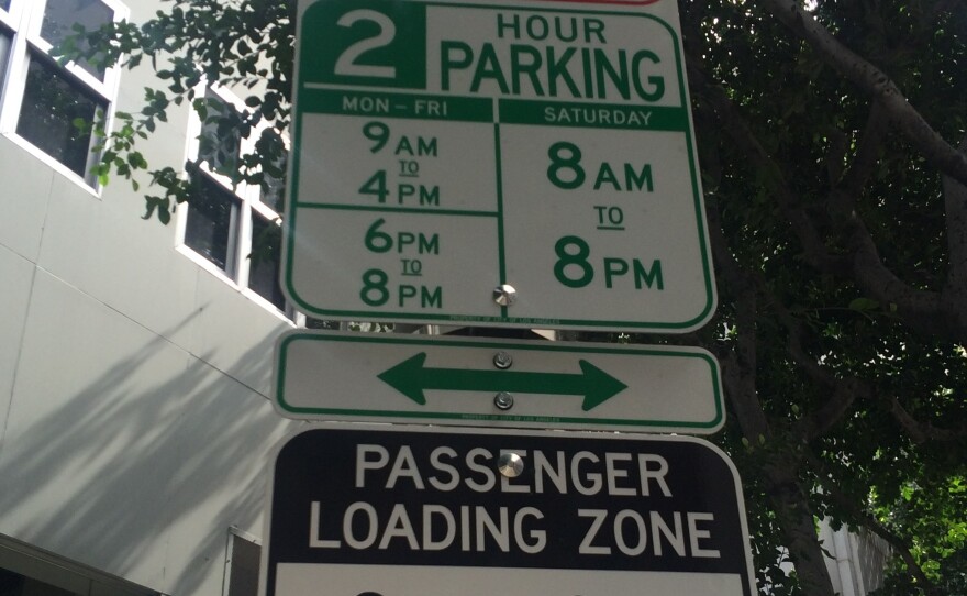
In Los Angeles, it's really not the traffic, it's the parking.
Every Angeleno has endured that nerve-wracking search for a spot, circling and circling and circling city blocks. Then, when you finally find a space, you've got to solve the logic puzzle that LA parking signs can sometimes be.
For years now, every parking restriction on a spot has had its own sign. A sign for loading zone hours. A sign for street cleaning hours. A sign for parking permit details. That meant, sometimes, a single parking spot could have seven or eight parking signs, which can be maddening.
The city is now trying to fix that problem. This weekend, LA rolled out 100 new parking signs in a small section of downtown for a six-month trial run. If it all works out, the new signs would mean only one sign per parking spot.
The signs are grids — each day has a column that's color-coded hour by hour, telling you when you can park. If it's green, you're good to go. If it's red, you can't park. If certain times are black, the spot is a loading zone during that time. During a news conference announcing the new signs last week, LA Mayor Eric Garcetti said of the new grids, "All you have to do is look at what day it is. Look at what time it is. And with easy color-coding and easy graphics, you should know whether or not you can be there."
The city says the signs will also feature QR codes and smartphone-readable beacons that will provide the "foundation for developers to create apps that provide parking and other information."
Garcetti acknowleged that the current system of finding a parking spot in LA is "one of the most frustrating things we all experience, and I think most Angelenos are convinced that the city is out to get them." He added, "In the past, quite often, it seems like we've designed a more and more difficult system."
Designer Nikki Sylianteng of Brooklyn, N.Y., created the new parking signs. After getting a $95 parking ticket during a trip to LA, she returned to New York and cooked up the idea. She put up the templates on her website, and soon after was approached by the City of Los Angeles.
So, how do Angelenos like the new signs? In an entirely unscientific survey conducted on Spring Street downtown, opinions were mixed but generally leaned negative.
"It makes sense, but it's not easier, that's for damn sure," said Craig Jenkins. He prefers the old system of multiple signs, saying, "I'd rather just read three signs than look at one graph. I think stick to the classics."
Laury Wollery was a little more positive. "It's pretty straightforward once you take a look at it," he said. "It takes some time to read and understand, but it makes more sense."
But he added that it might not be the best solution to the problem. "I always thought that the best parking sign would be an LED that says, 'Park Here [or] Don't Park Here,' " he said. "And then you move on with your life. But, if they can't do that, this is the next best thing, I guess."
Sarah Little said, "What fascinates me is that there's a committee of people that sat in a room together, and they were like, 'How are we gonna make this better.' And this is what they come up with," she said. "This just looks like a fantastic waste of funds."
And then there's Craig Jenkins' solution to LA's parking confusion: "Make it free."
How do you like the new parking sign? Let us know in the comments thread.
Copyright 2015 NPR. To see more, visit http://www.npr.org/.


